There are a number of things that prevent me from acclaiming the iPhone as the holy grail of all mobile devices. However, in an attempt to avoid coming across like some tech pundit who simply wants features checked off down the list, I’m going to concern myself primarily with discussion of that which presently exists. This first installment describes the first things a user will notice upon using an iPhone.
General Usage
The first thing you notice on an iPhone is its manner of scrolling. The subtle use of acceleration and deceleration leads to a very engaging interface and (hooray!) eliminated scrollbars. However, as an experienced computer user, I found that I was often scrolling the wrong direction.
The problem lies in the fact that there are two actions, both of which lend themselves very well to natural mapping. On a scroll wheel (or an Apple trackpad with two fingers) moving in the “downward” direction causes the screen to adjust downward. On the iPhone, the mapping can be thought of as a piece of paper: you put your finger on it and move the paper around behind the viewport. Both of these make sense but are diametrically opposed. The tension is added to by learned behavior, and as such, in order to be successful at (something as simple as!) scrolling I had to completely retrain my thinking.

There isn’t really any way to reconcile these two mappings but I suggest a solution that the first person shooter gaming genre has been doing for years: provide the ability to set this. This would seem to be a relatively trivial change with just adding in the ability to multiply scroll-position changes by -1.
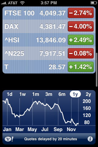
Homepage
The home page of the iPhone provides a slick interface for accessing both the most commonly used applications and the ability to have many more applications, divided by pages. However, it too is not without flaws.
Number one on my list is the little indicator at the bottom of the screen which is used to identify which page the user is on. I’ve watched a couple of people very frustratedly try and use that indicator to jump to page five from page one before realizing how it actually works: if you click to the left of the current page, you move one page to the left, and vice versa. This breaks from the learned behavior users have developed working with tabbed interfaces by not providing this implied functionality.
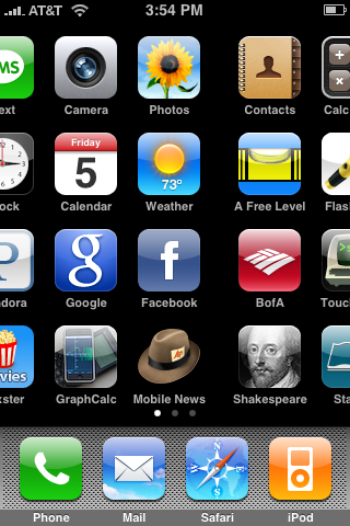
As a bug report, it is possible to get the home screen stuck between pages. There are two ways to accomplish this:
- Most simply you can scroll to halfway between two screens with one finger and then use a second finger to select and hold an application to trigger the rearrange mode. At this point the phone will think you’re on whatever screen is represented by the dots and attempting to move any application results in that application immediately jumping to the page where that is identified by the indicator.
- The second method is much harder to reproduce. Using the same method of scroll handling as described by Apple, where you can flick it and then press again to stop scrolling immediately, you can stop the pages in mid-transition.
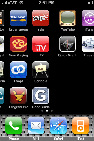
Rearranging the icons is a nice touch, but Apple seems stuck on the idea that everything must be handled linearly. The first example that affected me was the way in which pages are added: only to the far right end, not to the left as well. I personally have set up my default home screen to be the second of three pages. That unnecessary limitation resulted in my having to move all of my default icons to the second page instead of simply moving one or two to a newly inserted page in the position one to the left. Additionally, all icons are treated with the idea of a collapsible auto-arrange. That makes it easier to program the method of moving a specific icon from the grid and displacing others but prevents me from having logical separations within a page. Chalk these two up as feature requests if you will, but having an interface that doesn’t help the user is effectively crippling itself.

Summary
Not even the first two things a user encounters on an iPhone, the unique scroll handling and the homepage, quite live up to the reputation which Apple has been given in terms of solid UX design. The issues, most of which seem exceedingly small in the scope of what would have to change to make them, were still overlooked. Next time I’ll start looking into some more application-specific tweaks.